The Rolling Win Rate Chart That Would Have Warned You Three Weeks Early
A single all-time win rate number is one of the slowest ways to notice a pattern is dying. There's a specific chart that catches it weeks sooner, and almost nobody plots it.
Every trading bot’s dashboard shows the same headline number: overall win rate, all-time, since the strategy went live. It feels like the right thing to watch. It’s also one of the slowest possible ways to notice something has actually changed.
Here’s why, and here’s the specific chart that fixes it.
The problem with an all-time average
An all-time win rate is a weighted average of everything that’s ever happened since you turned the strategy on. If a pattern ran well for two months and then started decaying, the two good months are still sitting in that average, diluting the recent bad stretch and making it look far less serious than it actually is.
This is the exact same lag effect that made the pattern-expiry problem hard to catch in the first place — you don’t get an alert when a regime shifts, you infer it from results, and if the metric you’re watching is a slow-moving cumulative average, you’ll infer it far later than you could have.
Here’s what that actually looks like plotted against a rolling window instead:
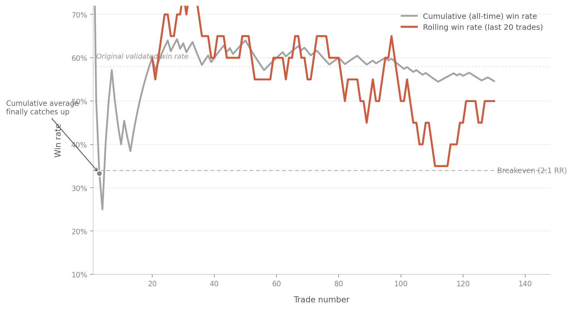
The gray line is the cumulative, all-time win rate — the number most dashboards show by default. The orange line is a rolling win rate calculated over just the last 20 trades. Both lines are looking at the exact same sequence of trades. The rolling line drops below the breakeven threshold and stays there well before the cumulative line ever does, because the cumulative line is still carrying the weight of every good trade from weeks earlier.
The shaded region between the two markers is the real cost of watching the wrong metric — that’s the stretch of time where the strategy was already underwater on a rolling basis, but the dashboard’s headline number still looked fine.
Why this isn’t just “use a shorter timeframe”
The instinct once you see this might be to just always look at recent trades instead of all-time ones. But a rolling window has its own tradeoff, and it’s worth being explicit about it rather than assuming shorter is always better.
A very short rolling window — say, the last 10 trades — reacts fast but is noisy. Normal variance in a genuinely healthy pattern will regularly push a 10-trade rolling win rate below breakeven just from ordinary bad luck, even when nothing about the underlying edge has changed. If you react to every dip in a window that small, you’ll be pausing and second-guessing a perfectly fine strategy on a regular basis, which is its own kind of damage — this is the same intervention problem that undermines systematic trading psychologically, just triggered by a metric instead of a gut feeling.
A very long rolling window — 100 or 150 trades — is stable and rarely gives a false alarm, but it’s barely different from the all-time cumulative number and suffers from almost the same lag.
The window size that actually works sits in between, and where exactly it sits depends on how many trades your pattern generates in a given period and how much natural variance it has. This is a real calculation, not a guess, and it comes down to how much statistical noise exists at a given sample size.
What sample size actually buys you
This is the part that connects directly to the overfitting conversation, from a different angle. Here’s what the plausible range of “true” win rate looks like at different sample sizes, holding the observed win rate constant at 55%:
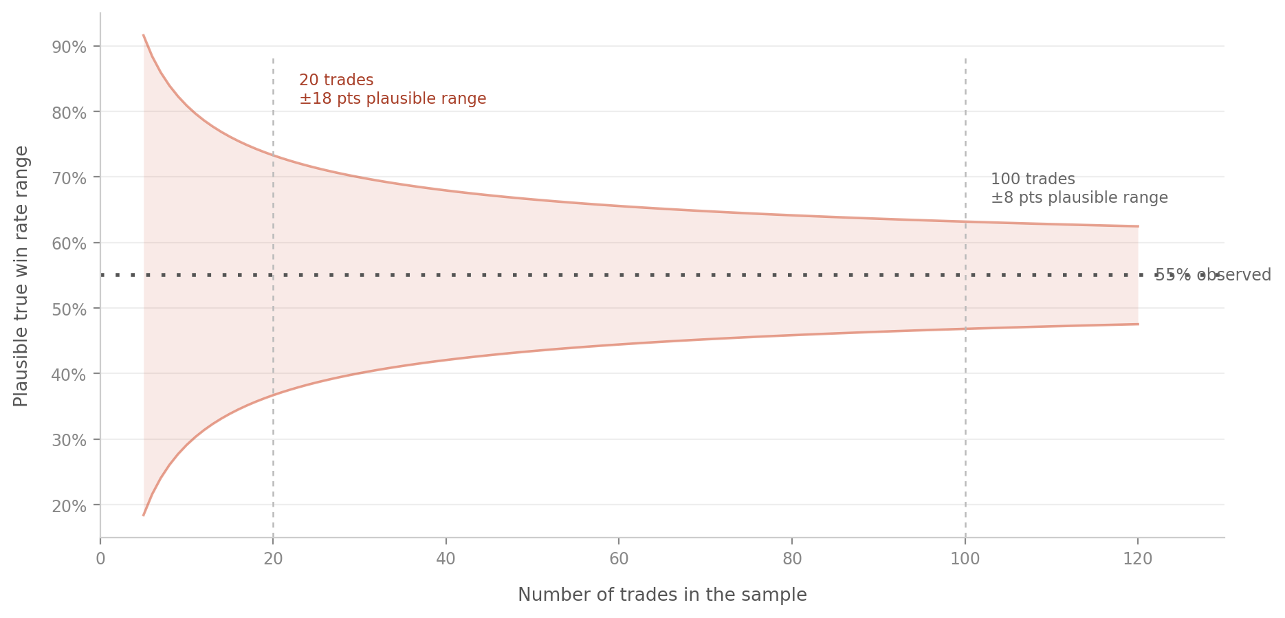
At 20 trades, an observed 55% win rate could plausibly reflect a true underlying win rate anywhere in a wide band around it — the small sample simply doesn’t carry enough information to pin the number down tightly. At 100 trades, that same observed 55% is a much more reliable estimate, because the band of plausible true values has narrowed substantially.
This is exactly why a 10-trade rolling window is so noisy — you’re trying to read a signal out of a sample size where the plausible range of outcomes is still wide, even when the underlying pattern hasn’t changed at all. And it’s exactly why a 20-trade window, while better, still needs to be read with the understanding that some of what it shows you is just sampling noise, not necessarily decay. The chart above is the same logic underlying the train/test validation process, applied to live monitoring instead of historical backtesting.
Building this into what you actually watch
The practical takeaway isn’t “replace your all-time win rate with a rolling one.” It’s “watch both, and understand what each one is actually telling you.”
Use the cumulative number to judge whether the strategy has been worth running overall. This is the correct metric for the big-picture question — has this pattern made money since inception. It’s just the wrong metric for catching a recent shift quickly, because that’s not the question it’s built to answer.
Use a rolling window sized appropriately to your trade frequency to catch decay early. If your pattern generates roughly 10 trades a week, a 20-30 trade rolling window gives you a rough 2-3 week lookback that’s short enough to react to a real regime shift while being long enough to avoid flagging every ordinary losing stretch as a crisis.
Plot both together, not just one number in isolation. The value isn’t really in either line individually — it’s in the gap between them. When the rolling line is meaningfully below the cumulative line and staying there, that gap is your signal. When they’re tracking close together, the strategy is behaving consistently with its own history, whichever direction that history has been.
Pre-commit to what the rolling line needs to do before you act on it, the same way you’d pre-commit to a drawdown threshold. Something like: if the rolling win rate over the last 25 trades stays below breakeven for two consecutive weeks, that’s the trigger to pull the pattern back into the backtester and re-validate on recent data, not just a vague feeling that things seem off. Without a pre-set rule, you’re right back to reacting emotionally to whichever line you happened to glance at that day.
What this would have actually bought you
Going back to the chart at the top — the gap between when the rolling window first flags trouble and when the cumulative average finally catches up covers a real, meaningful stretch of live trading, all of it happening while the strategy is quietly running underwater and the headline dashboard number still looks acceptable. That gap is not a rounding error. It’s the difference between catching a dying pattern while the damage is still small and only noticing once the damage has been large enough to finally drag down an average built from months of history.
The chart everyone already has — the single all-time win rate — is answering a real question. It’s just not the question you need answered when you’re trying to catch decay early. A second, shorter line next to it is a small addition that answers the question the first one structurally can’t.